RydeCheck: A Case Study in User-Centered Design.

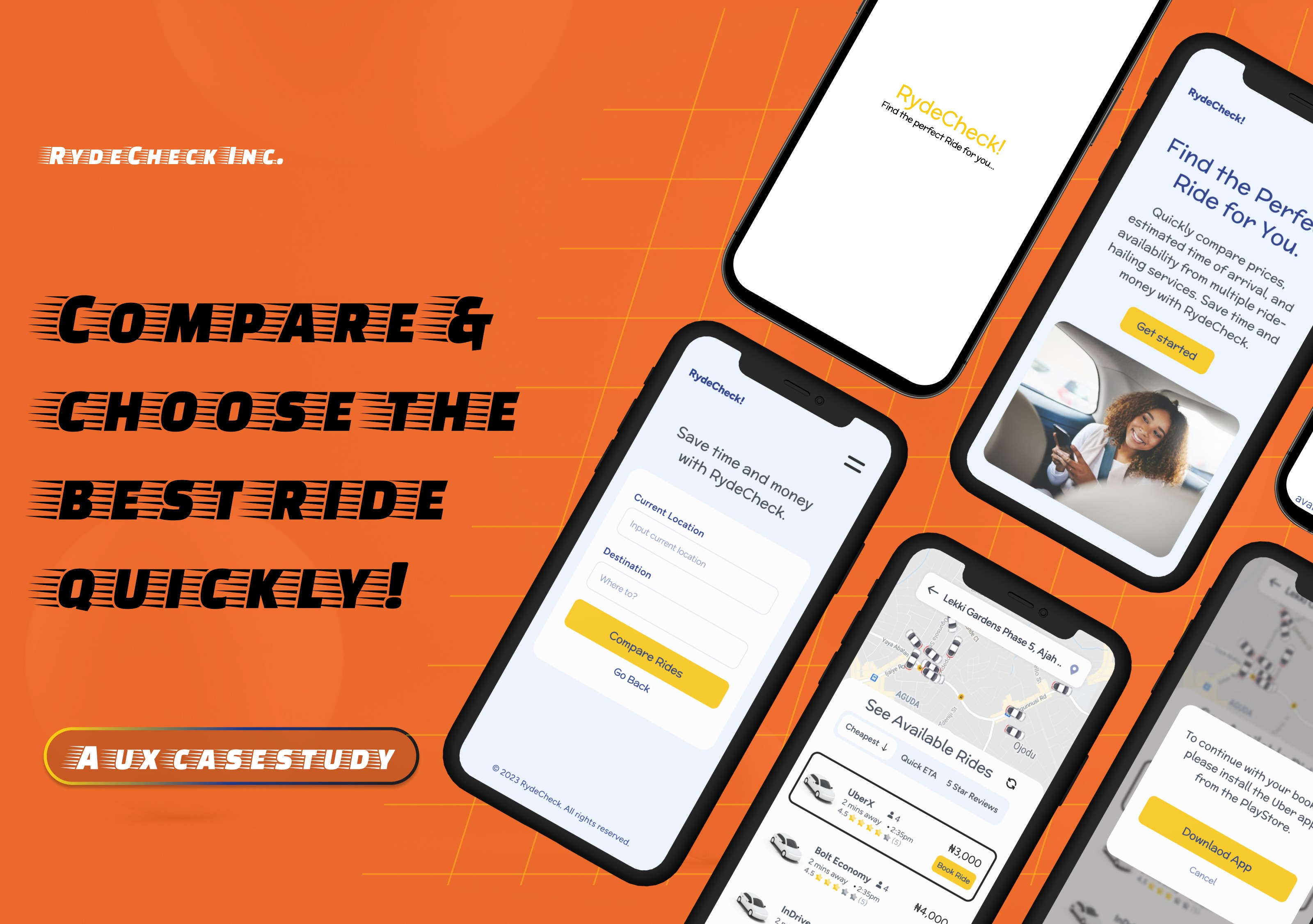
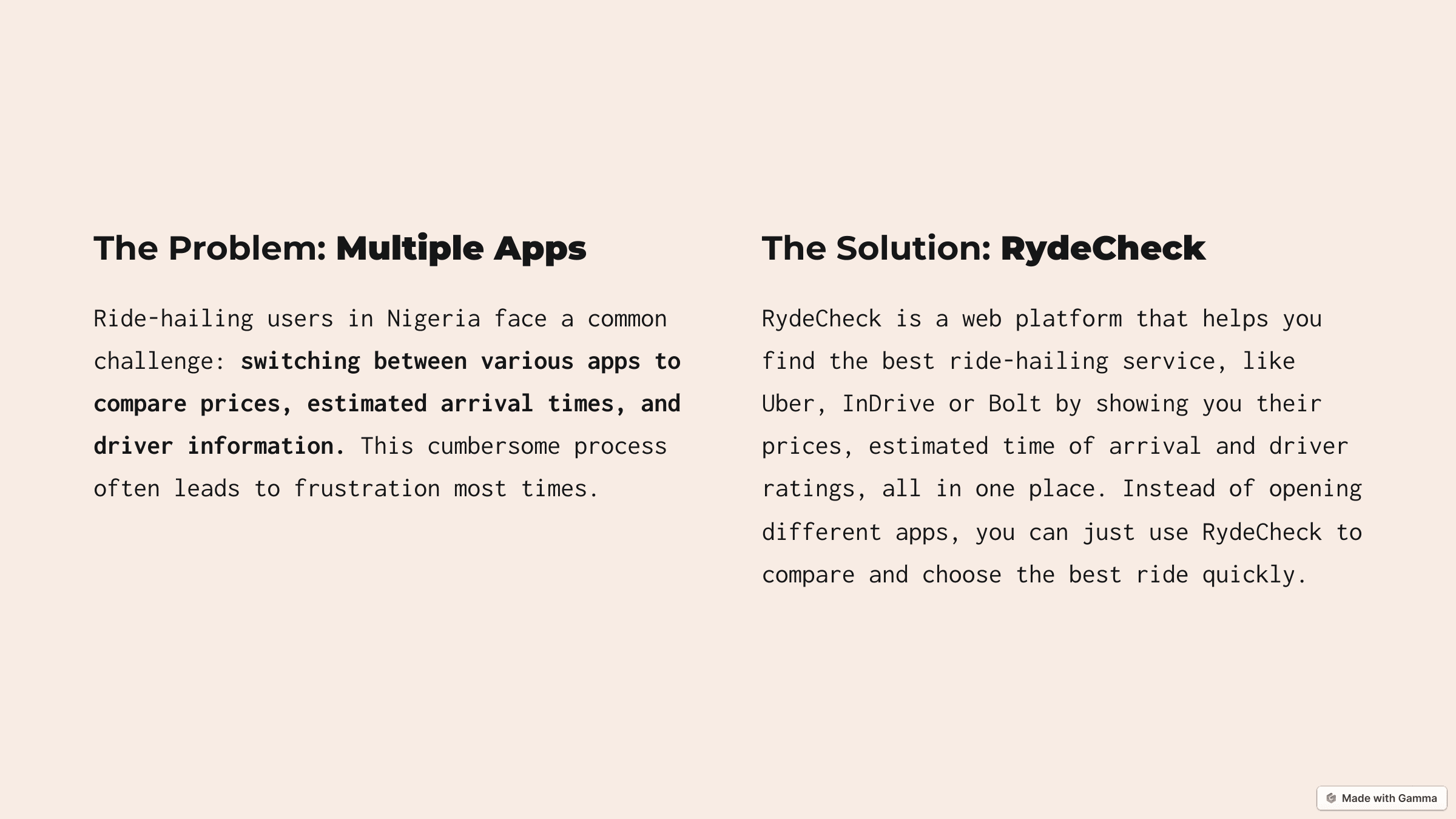
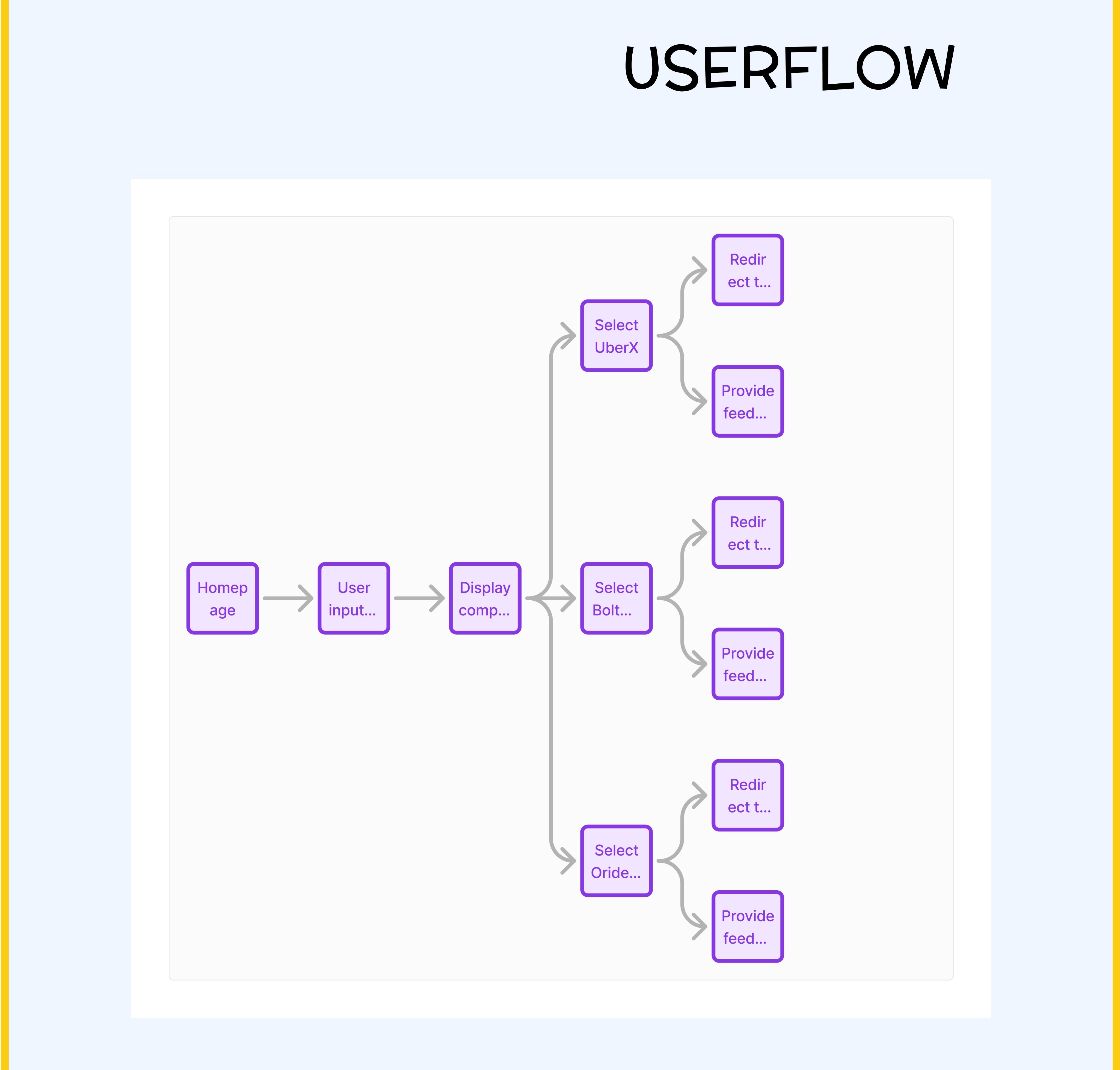
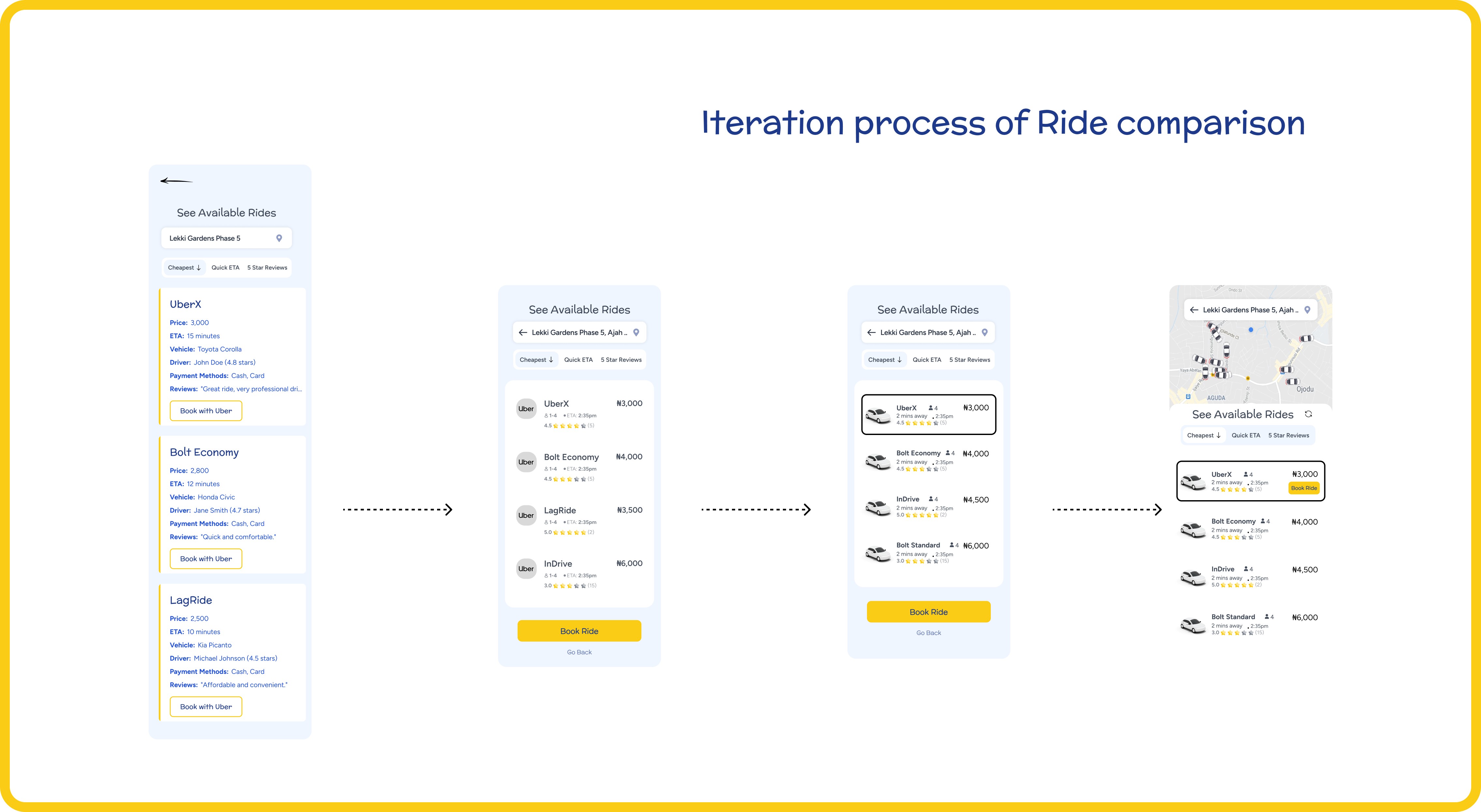
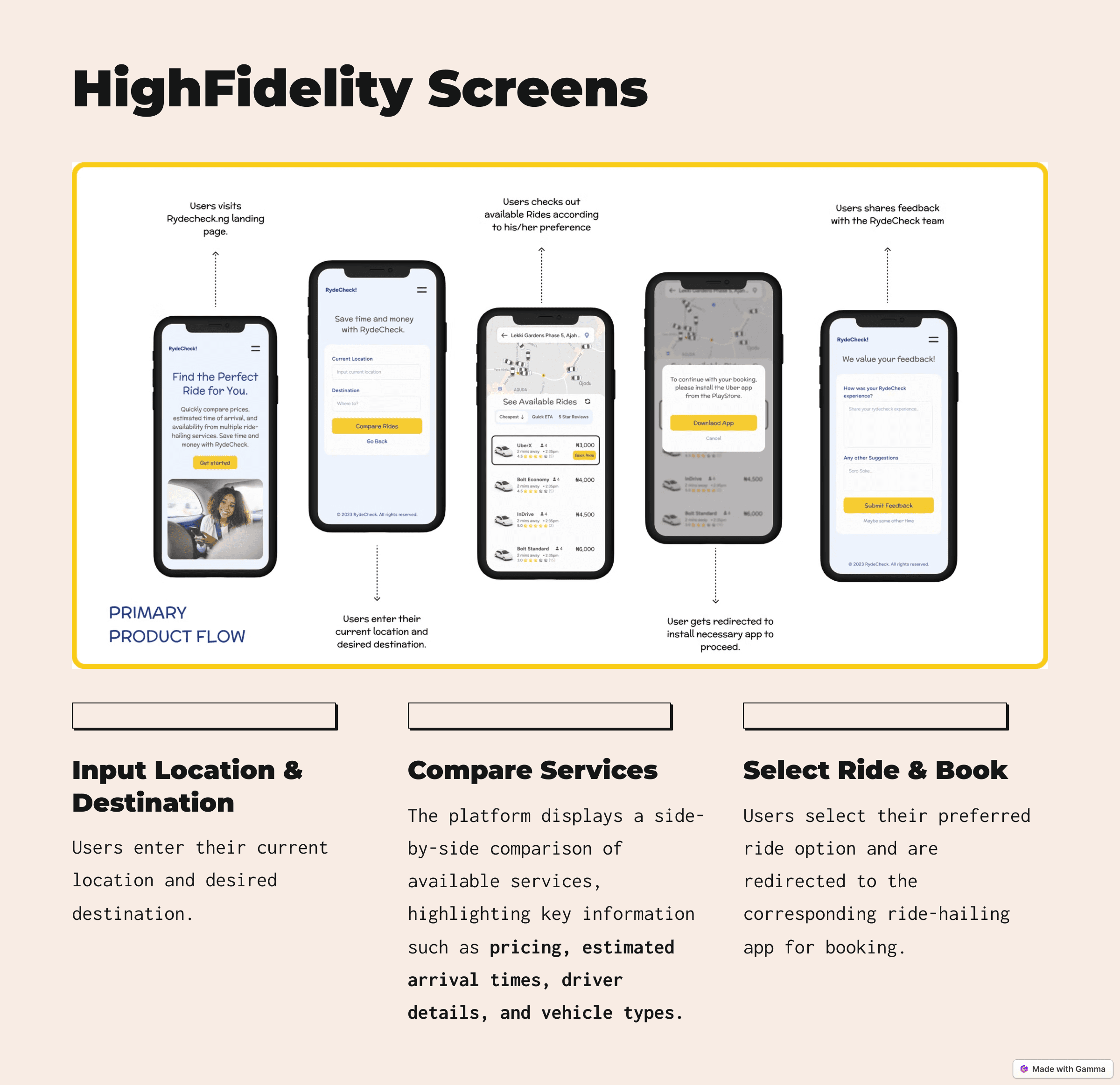
This Casestudy showcases RydeCheck, a webapp platform that helps Nigerians find the best ride-hailing service like Uber, InDrive or Bolt by showing you their prices, estimated time of arrival and driver ratings, all in one place. No app-switching, no hassle. Just smart, fast ride-hailing comparisons so users can make the best choice in seconds

Role

Product Designer

Product Designer

Product Designer

Industry

Transportation & Technology

Transportation & Technology

Transportation & Technology

a cell phone on a table

The RydeCheck Story

Here’s the thing: Ride-hailing in Nigeria can be a headache. I constantly switch between Bolt, Uber and InDrive just to find a ride that’s affordable and fast.

One day, I made a mistake that sealed the deal for this idea. In my rush to get a ride, I accidentally booked two rides on different apps. Both drivers showed up at the same time! I had to apologize to one and cancel the trip, wasting his time, fuel and effort. That moment, I thought, “There has to be a better way to compare all these options in one place.”

That’s how RydeCheck was born—a simple web platform to help users compare ride prices, arrival times, and driver ratings from Bolt, Uber and InDrive in one place.

My Design Process for Rydecheck

Stage 1. User Research

To truly understand the struggles of ride-hailing users in Nigeria, I conducted a mix of online and in-person research:

  • Interviews: Spoke to over 30 ride-hailing users, including friends and family, to gather insights about their experiences.

  • Surveys: Created a Google Form survey to reach a wider audience and collect data on common frustrations and preferences.

  • Findings:

    • Users often switch between apps to compare prices and arrival times.

    • Many find it frustrating to repeat the same search across multiple platforms.

    • Some users (like myself) even end up booking multiple rides by mistake, causing unnecessary stress for both drivers and users.

    • Users prioritize finding the most affordable ride, often comparing prices across multiple platforms like inDrive, Uber, Bolt etc

    • Users wants to see the ratings of the drivers, to make informed decisions about their safety and comfort.

    • Switching between apps is time-consuming and inefficient. Users desire a centralized platform for comparing services.

This phase gave me a clear direction to solve these problems with a single, unified platform.

Stage 2: Sketching & Wireframing

Before diving into detailed designs, I started with crafting a simple user flow and sketches to focus on the user experience:

  • Key Focus:

    • Simplifying the process of entering locations and viewing comparisons.

    • Ensuring users can easily filter and choose rides based on their priorities (price, time or ratings).

  • Wireframes:

    • Designed rough layouts for the search screen, comparison results and filters.

    • Iterated multiple times to ensure navigation felt natural and intuitive.

Stage 3: High-Fidelity Screens

Once the structure was solid, I brought the designs to life with high-fidelity screens:

  • Used bold, clean visuals to create a polished look while keeping usability in mind.

  • Highlighted key features like price comparison, arrival times and driver ratings.

  • Designed action buttons to make booking rides from the chosen platform seamless.

This allowed me to share and test the design with friends to get their feedback

two cell phones on a gray surface
a cell phone on a white block

Key Design Decisions

During the design process, I made several key decisions that shaped the platform. T

Stage 4: User Feedback & Refinements

The design wasn’t complete without getting feedback from real users, so I shared the prototype with friends and potential users to see how they interacted with the platform. Their feedback was incredibly valuable and helped refine the design:

Key Feedback:

  • Direct Ride Booking: A lot of users suggested that it would be more convenient to book rides directly from RydeCheck, rather than being redirected to their selected hailing rides app. This was a popular request and made sense as a key feature for improving the user experience.

  • Live Chatbox with Drivers: Several users pointed out that having a live chatbox to communicate directly with nearby drivers would be a helpful addition. It would allow users to quickly confirm ride details or address any concerns in real-time.

Although time constraints meant I couldn’t implement these features immediately, I recognized that they were essential for the platform’s future growth.

Overall Impressions:
Beyond those features, everyone was absolutely impressed with how seamless the user journey was. They loved how easy it was to compare rides and the smooth navigation throughout the platform. The enthusiasm was evident, with users expressing how excited they would be to use a product like this in real life.

a pair of cell phones on a concrete block
a cell phone with a yellow rectangular screen

Next Steps for RydeCheck:

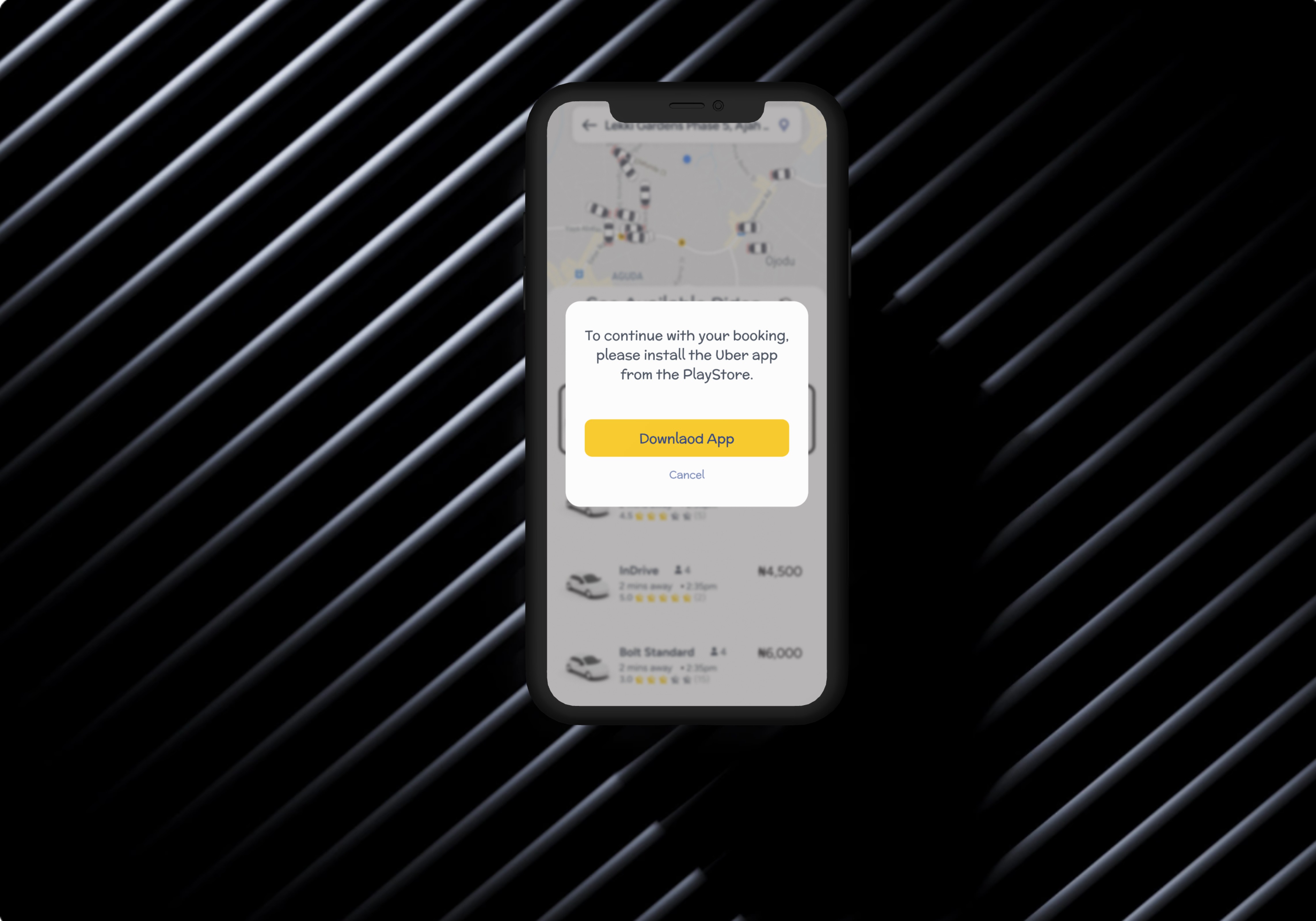
  • Booking Integration: Implement the ability for users to book rides directly through RydeCheck, reducing the need to redirect to other platforms.

  • Live Chat Feature: Add a live chat feature allowing users to communicate with nearby drivers in real time.

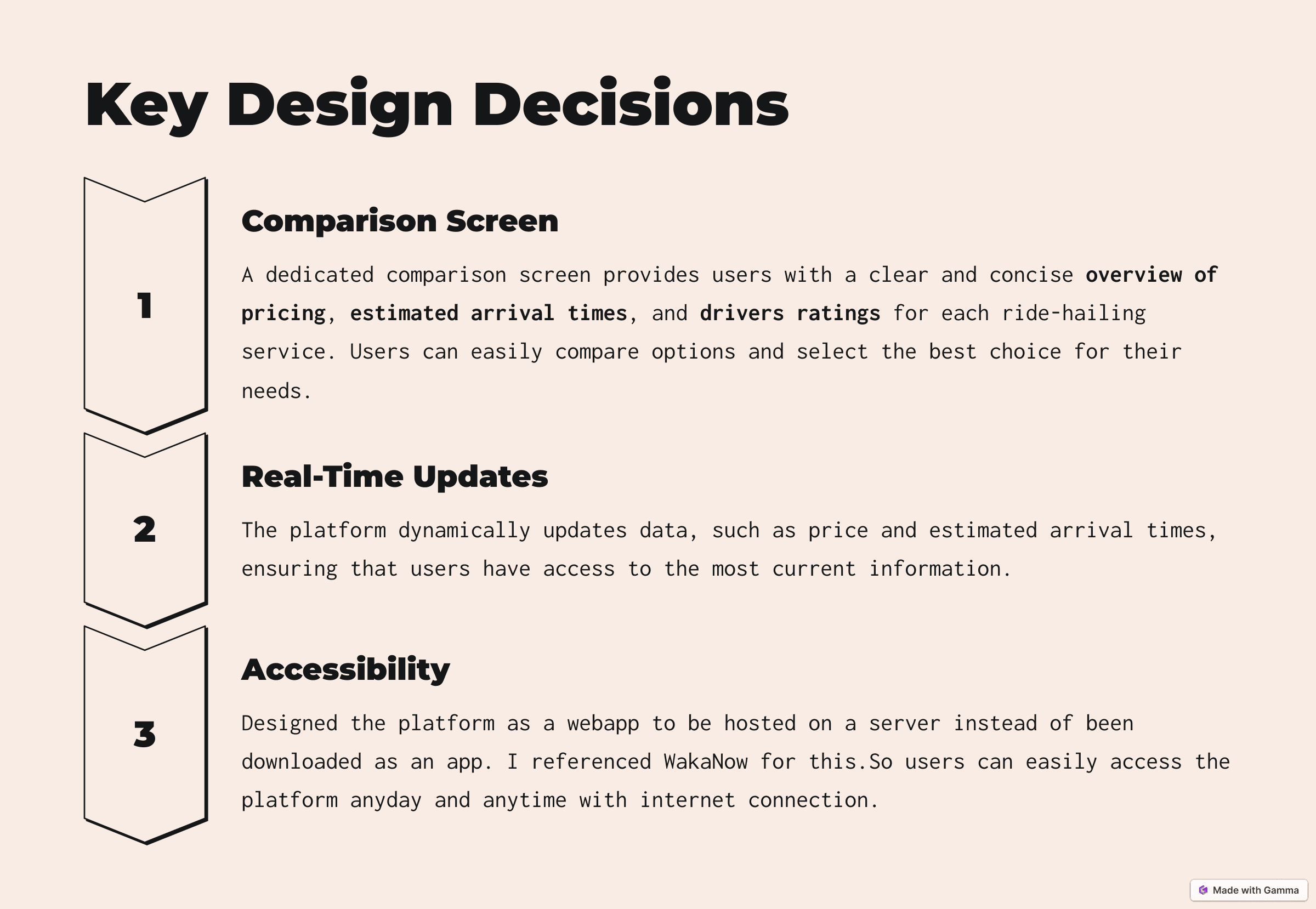
  • API Integration: Secure APIs from major ride-hailing services like Uber, Bolt and InDrive to pull in real-time data on pricing, ETAs and driver ratings.

  • Develop MVP: Build the minimum viable product with core features, focusing on a seamless user experience for comparing rides.

  • Launch Beta: Release the beta version to a small group of users for initial testing and bug fixes.

  • Partnerships: Explore potential collaborations with ride-hailing platforms to enhance the service offering and ensure long-term sustainability.

Proposed Challenge:

One challenge I anticipate is scaling the platform. While the web app offers accessibility, integrating live data from multiple ride-hailing services and ensuring accurate, real-time updates could be complex. This requires a reliable backend system and strong partnerships with ride-hailing companies, which might take time to establish.

Learnings and Reflection:

Building RydeCheck was an eye-opening experience. I learned how important user feedback is in refining design decisions and ensuring the platform meets their needs. I also realized the significance of simplicity and usability when designing. Most importantly, this project reinforced my belief in solving real-world problems with design that’s intuitive and straightforward.

Link to this prototype can be found here

Other projects

Copyright 2024 by Akodu Loveth

Copyright 2024 by Akodu Loveth

Copyright 2024 by Akodu Loveth