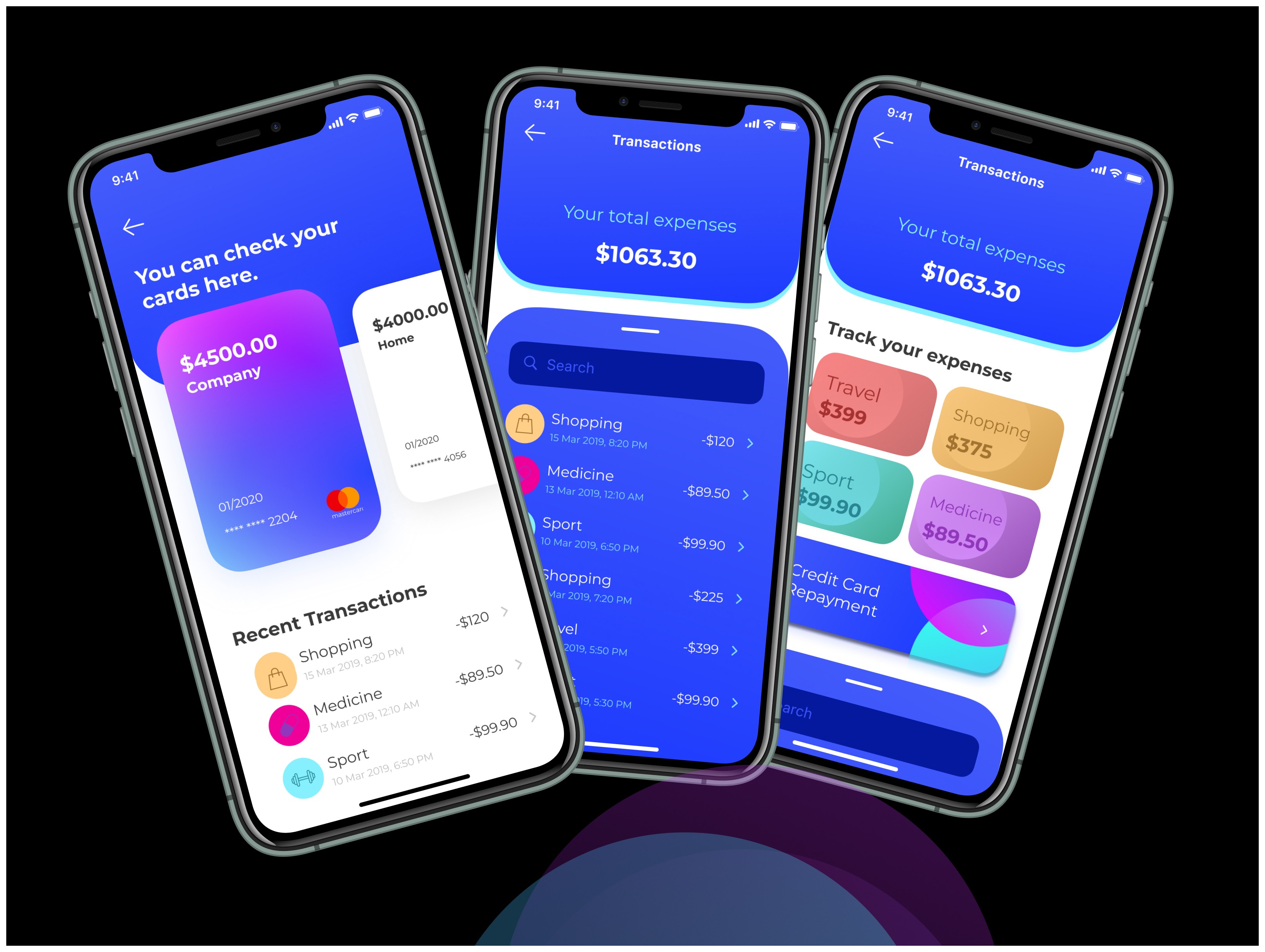
UI project: Track and manage your finance with Money App
So, picture this: I wanted to get better at UI design and thought, "What better way than creating a finance app?" Money App became my playground—a bright, colorful and super-friendly app for managing money. No boring screens, no stiff designs. Just something that feels good to use, even when you're tracking expenses or sending money to loved ones.
Role
Industry

Why This Matters to Me
This wasn’t just about designing an app; it was about pushing myself to try something new. I wanted to prove that financial management doesn’t have to be boring—it can actually look and feel good. And hey, if it makes you smile while tracking expenses or sending money, that’s a win in my book.
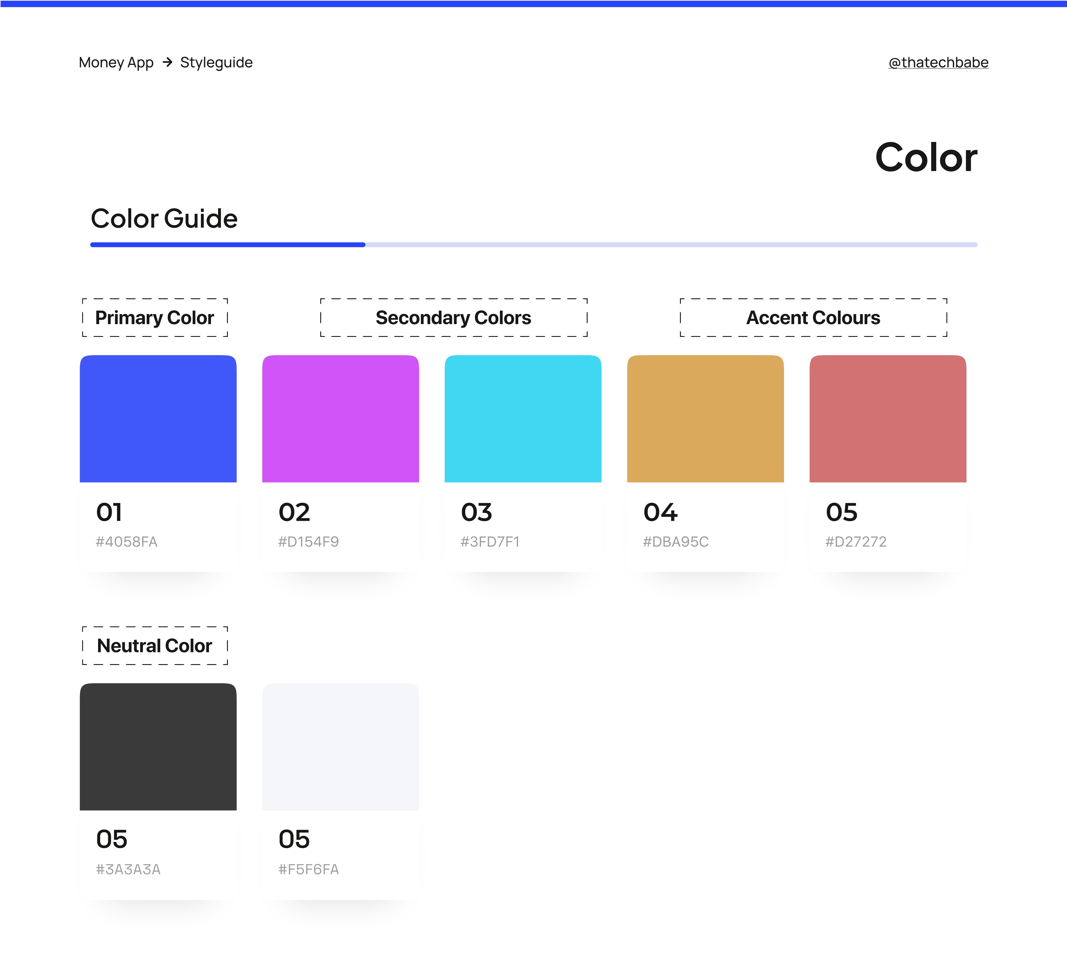
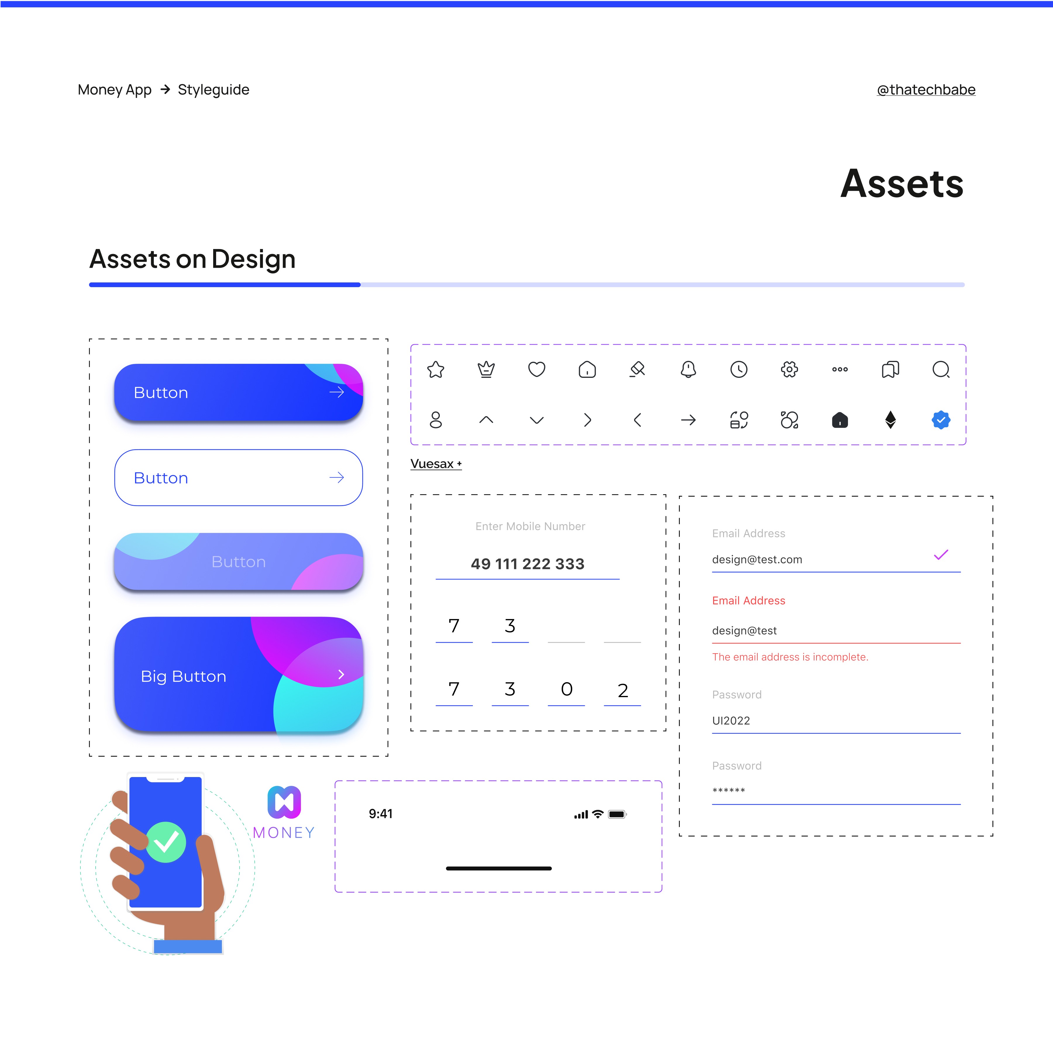
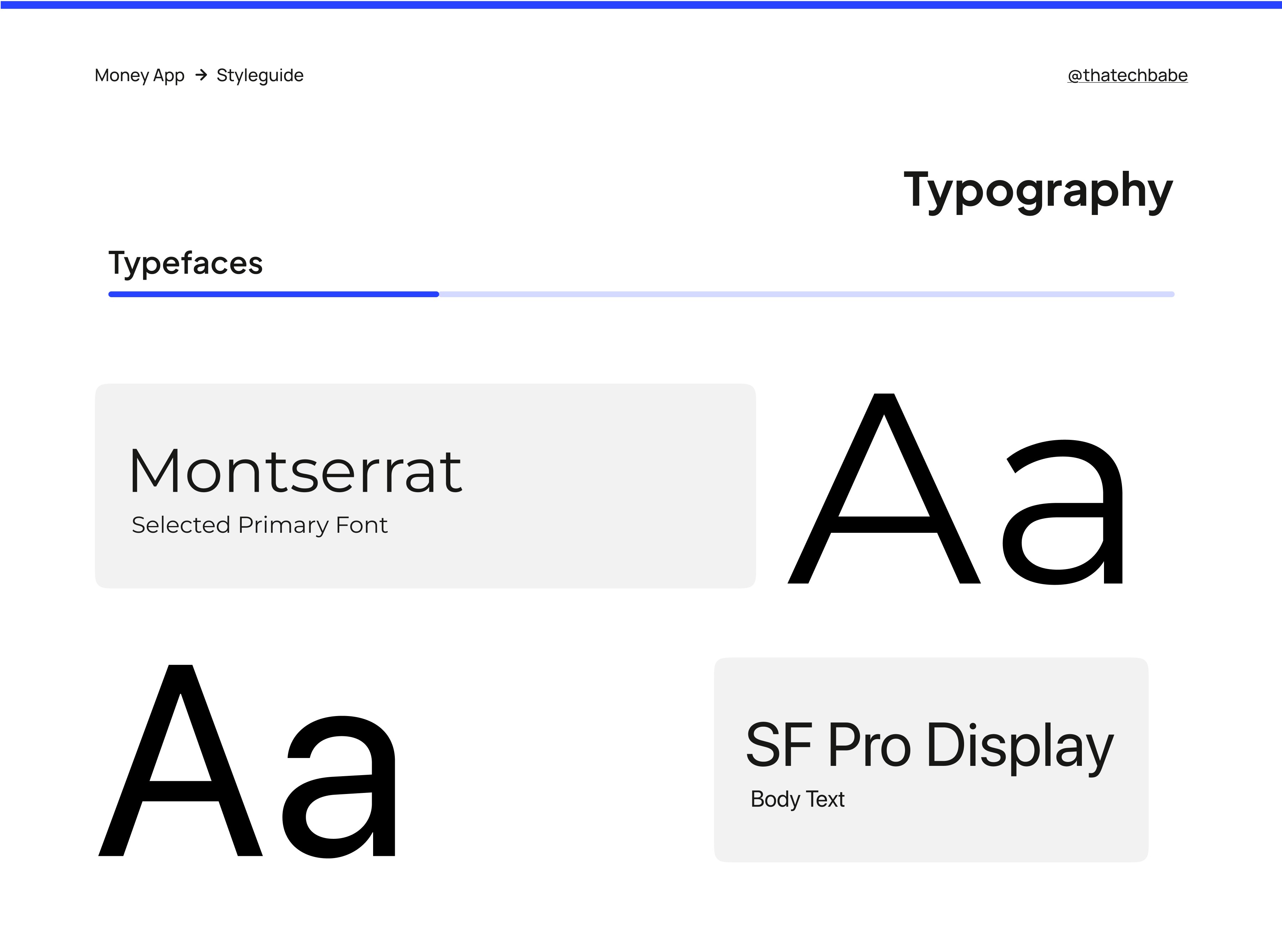
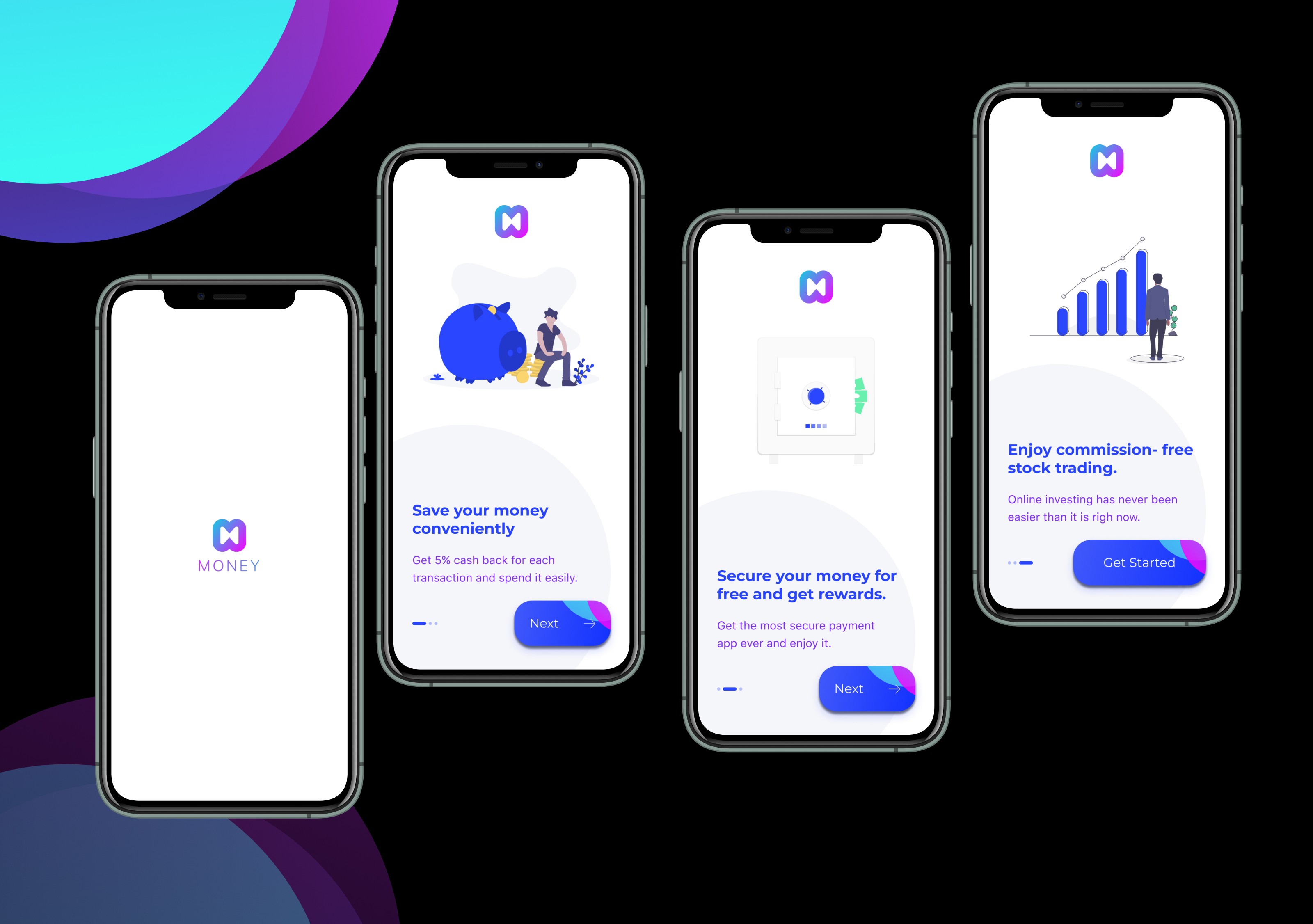
A Sneak Peek
From the moment you open Money App, it’s all about bright colors, clean layouts and a design that feels like it’s rooting for you. I’m pretty proud of how it turned out and it’s taught me a lot about balancing fun with function.
Other projects
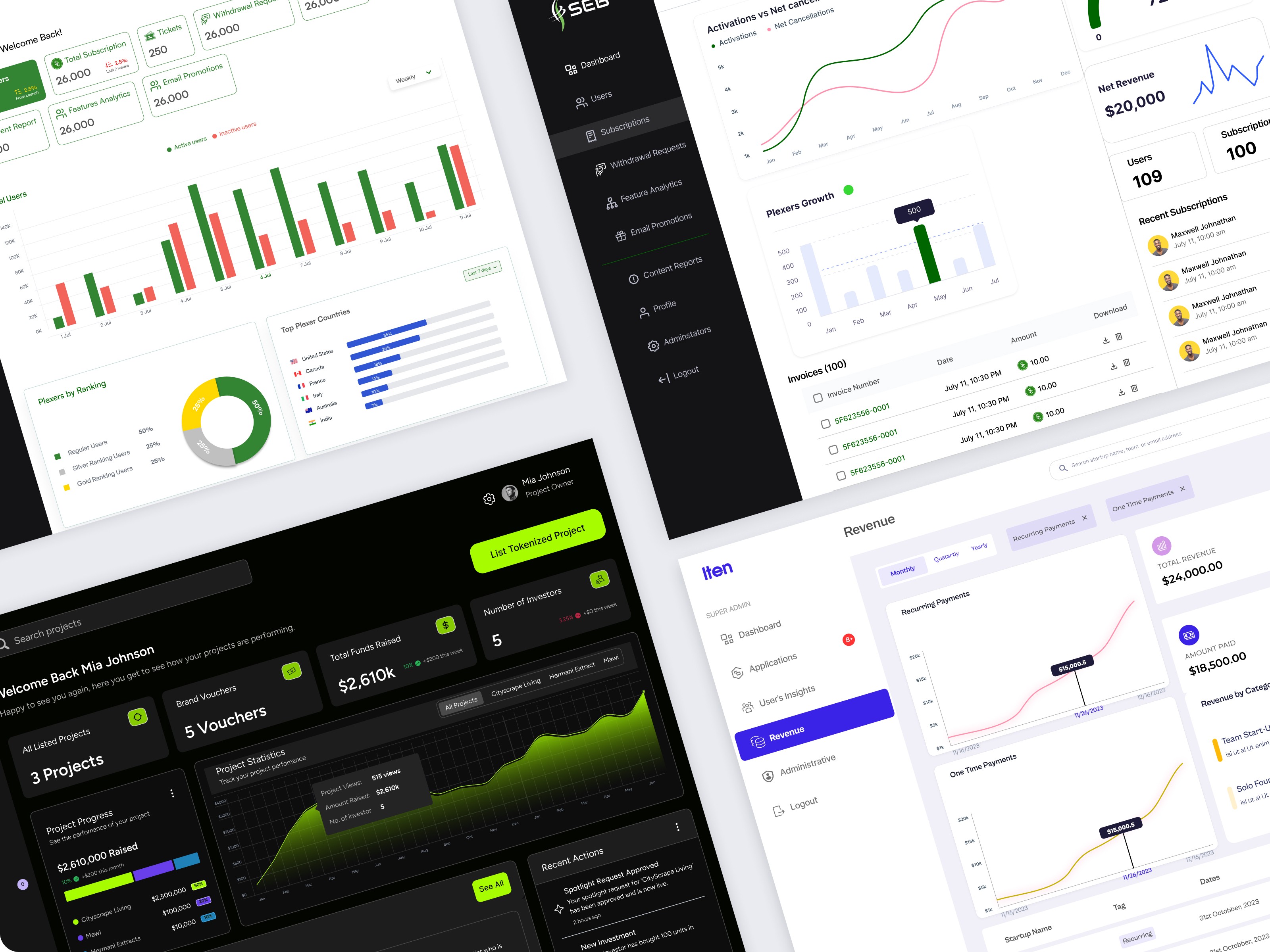
Data Visualization Projects
A peek into the dashboards I’ve designed, where data meets clarity. Each design showcases my approach to turning raw information into visually intuitive tools that drive decisions.
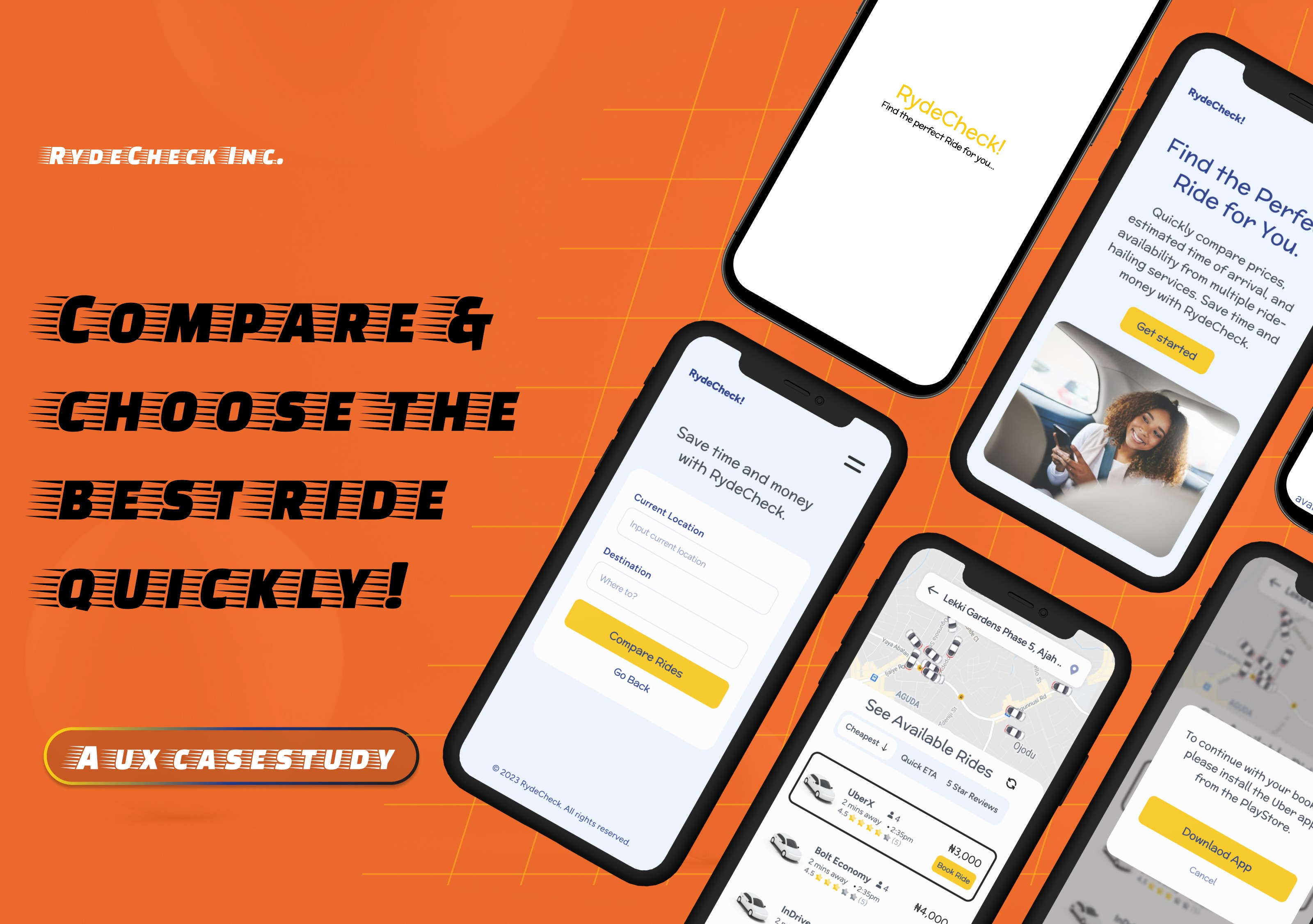
RydeCheck: A Case Study in User-Centered Design.
This Casestudy showcases RydeCheck, a webapp platform that helps Nigerians find the best ride-hailing service like Uber, InDrive or Bolt by showing you their prices, estimated time of arrival and driver ratings, all in one place. No app-switching, no hassle. Just smart, fast ride-hailing comparisons so users can make the best choice in seconds
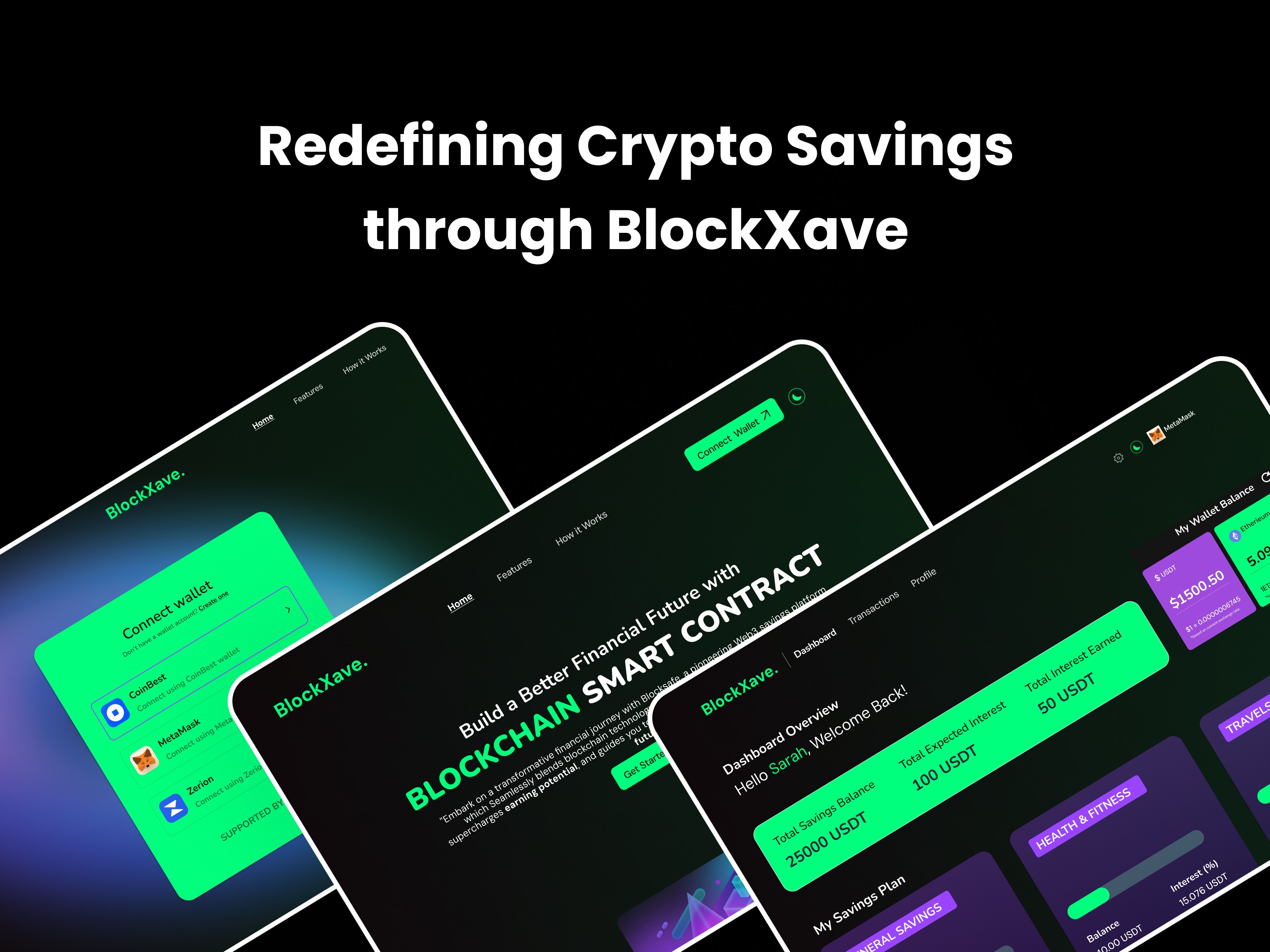
Redefining Crypto Savings through BlockXave
For many crypto holders, savings can feel like a dead end—confusing tools, risky platforms, and assets that sit idle. In a world where financial literacy remains a challenge for many, and traditional savings yield negligible returns, BlockXave aims to change the narrative.